Kodak B&W film delivers a unique visual signature to Robert Eggers’ acclaimed fantasy horror 'The Lighthouse'
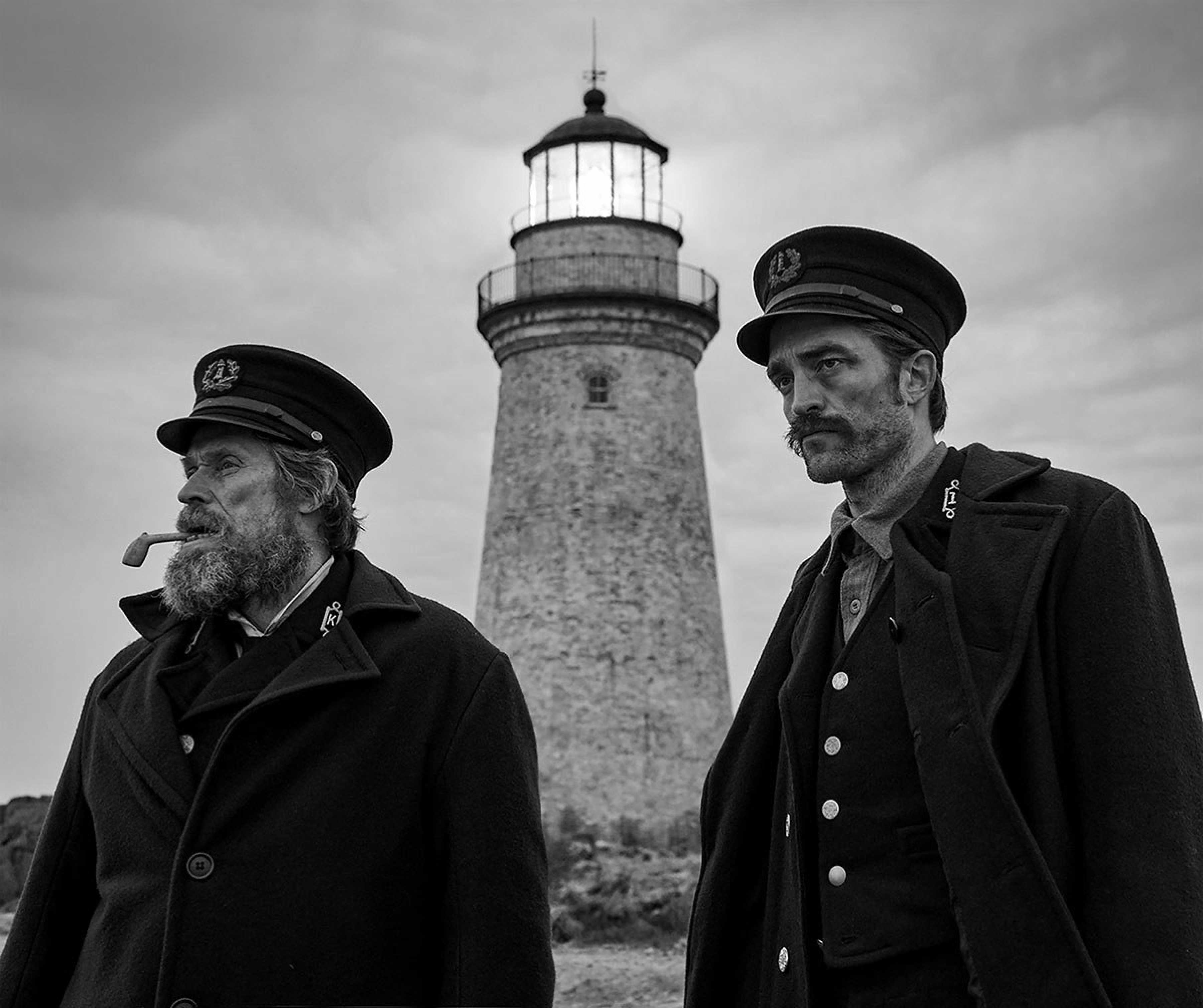
Willem Dafoe (r) and Robert Pattinson (l) star in Robert Eggers’ period fantasy horror, "The Lighthouse." Image by Eric Chakeen. Courtesy of A24
Captured on Kodak B&W 35mm film, the stormy storytelling and captivatingly beautiful cinematography in director Robert Eggers’ gripping period feature, The Lighthouse, wowed reviewers after the movie screened at the 2019 Cannes Film Festival. The film went on to win the prestigious FIPRESCI Prize, awarded by professional film critics, and the creation of its distinctive, weather-beaten visual signature is quite a tale in itself.
The spooky story of The Lighthouse is set on a small, barren, isolated island off the Maine coastline in 1890s, and explores the increasingly maddening relationship between a junior lighthouse keeper (Robert Pattinson), who has a dubious past, and his superior (Willem Dafoe).
The film was written by the director and Max Eggers, with cinematography by Jarin Blaschke, a long-time collaborator on Robert Eggers’ various short films, before they shot the highly-acclaimed, mid-17th-century, supernatural horror film, The Witch (2015).
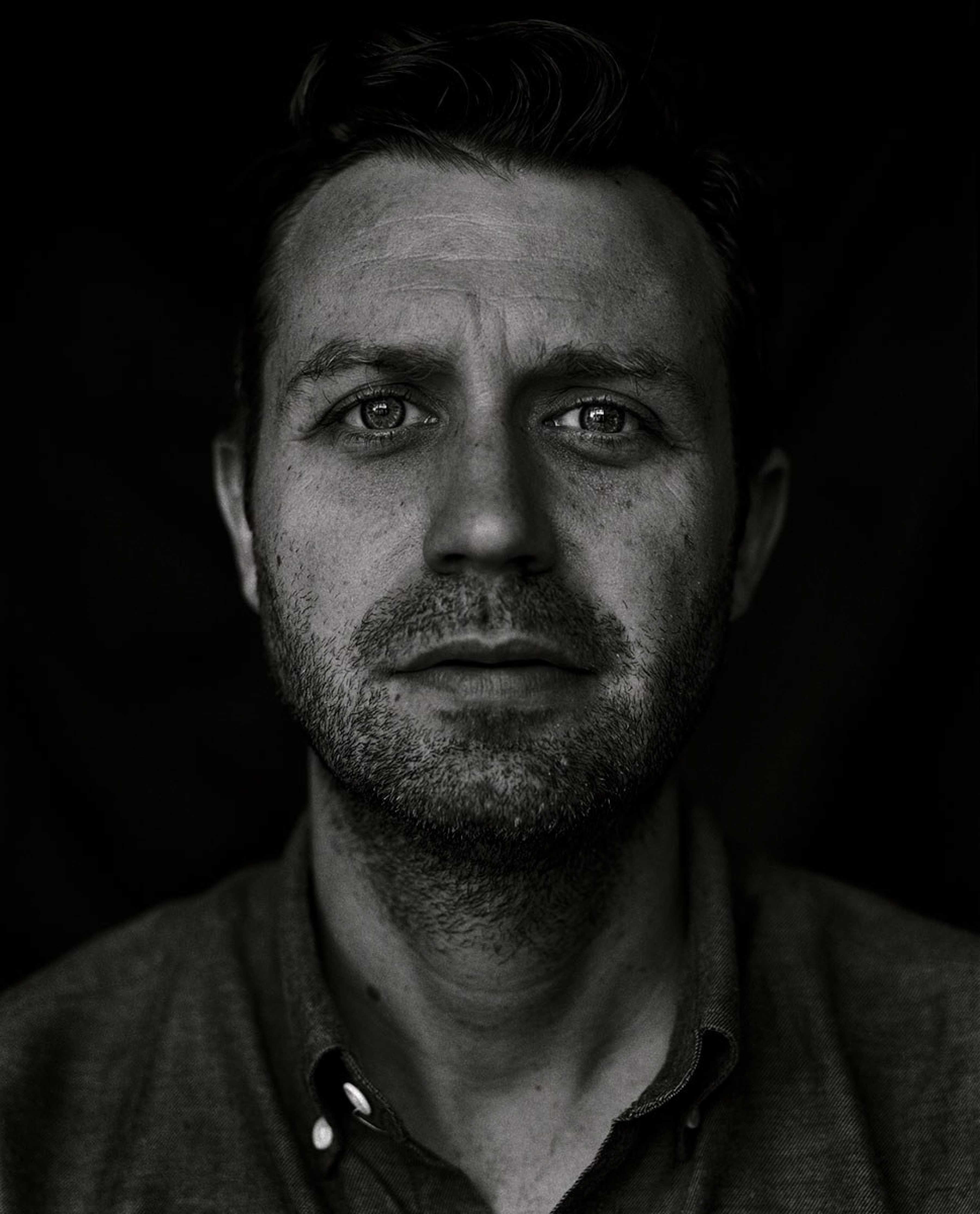
Headshot of DP Jarin Blaschke, the cinematographer on Robert Eggers’ period fantasy horror "The Lighthouse."
The exteriors of the film, and a small number of house interiors, were shot on Cape Forchu, the south-western extremity of Nova Scotia. The entire lighthouse and outbuildings were built from scratch, avoiding line of sight of an existing lighthouse, built in the 1960s. The upstairs set was built within an aircraft hangar nearby in Yarmouth. Most of the water work was shot in a large, emergency-responder’s training pool, capable of generating waves in varying sizes and patterns, located near Halifax. The remaining interiors, including the tall lighthouse interior, were built and shot in two large industrial spaces in Halifax.
Principal photography began on April 9, 2018, and was initially planned to for 31 days. However, due to the complexity of the shoot, paired with the erratic nature of unforgiving conditions on Cape Forchu, the schedule gradually expanded to 35 days.
“I first heard about Rob’s concept for The Lighthouse during production well before the funding of TheWitch,” says Blaschke. “From its most nascent beginnings, years before it was written, Rob knew The Lighthouse had to be unapologetically B&W, with a boxy aspect ratio. We shared ideas in fragments over time, and the film slowly grew on our respective back burners.”
From the get-go, Eggers wanted a 1.33:1 aspect ratio, due to the confined spaces, the limited number of characters and the vertical orientation of the lighthouse itself. However, upon what Blaschke recalls as a “flippant remark” about the obscure aspect ratio of 1.19:1, which existed very briefly during the transition to sound filmmaking, things changed.
“I teased Rob about how 1.19:1 would really satisfy what he was after,” says Blaschke. “Surprisingly and enthusiastically, he took to this idea. The Lighthouse became 1.19:1, and he started drinking-up what films he could find in that format.”
There proved to be a few useful examples, including a French WW1 film that takes place in a claustrophobic mine. But what really changed things was the most famous 1.19:1 film of all: Fritz Lang’s M (1931, DP Fritz Arno Wagner), the story of how criminals join in a manhunt when the city police are unable to catch a child-murderer.
“Watching that, I found a very modern film with surprising camera movement but more importantly: a modern, creative mastery in how visual information was withheld from the audience, how information was rewarded, and when,” says Blaschke. “With this new inspiration, I felt there was a highly-effective framework for me to express myself visually. Stepping away from a mere 19th-century emulation, we were on to something more surprising and layered.”
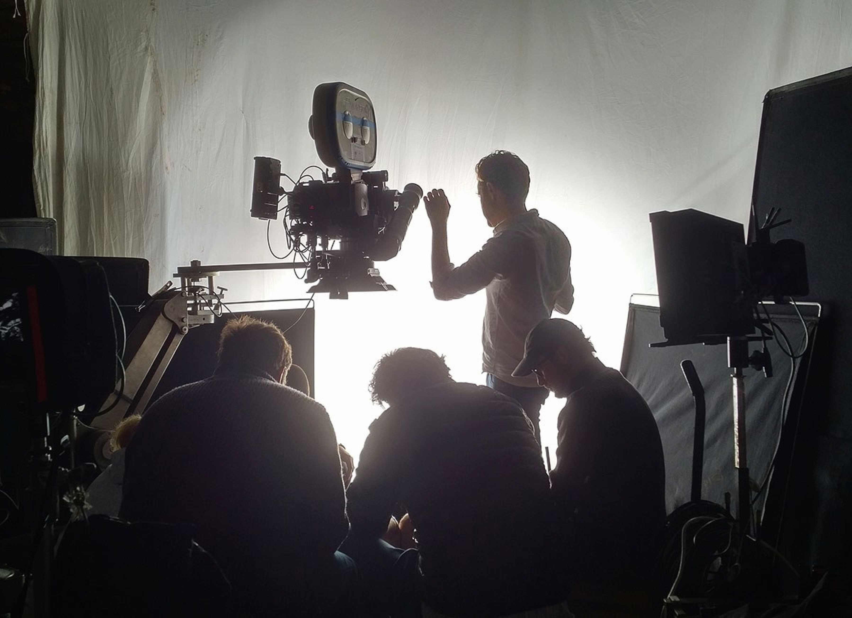
DP Jarin Blaschke pictured at a camera workshop filming on Kodak
As the story takes place in the 1890s, Blaschke also began thinking early-on about how he could evoke a transportive texture and palette, beyond being simply B&W, and thereby create an aesthetic that would become the visual signature of The Lighthouse.
“Two primary ideas emerged,” he says. “The first was the unsurpassed tonal range and ‘liquid’ look of a special class of developer (pyrogallol) that had its heyday at the turn of the century. The other was the hard tonal rendition of orthochromatic film, which exaggerates skin texture, atmospheric haze and brightens skies. This is because orthochromatic film can’t ‘see’ red light: ultraviolet and blue light are rendered quite light, whilst orange and red colors, such as skintones, are rendered darker. I realised that this would give a specific B&W tonal signature that would transport the viewer right to our period setting. Although the film developer idea didn’t work out this time, we were able to accomplish a very good orthochromatic look through unique filtration.”
During prep, Blaschke started by testing digital footage and color negative film (KODAK VISION3 500T Color Negative Film 5219 ), both desaturated in post, alongside EASTMAN DOUBLE-X 5222 panchromatic negative. Introduced in 1959, DOUBLE-X Film 5222 was used to create the moody intensity on many Hollywood features, such as Martin Scorsese’s Raging Bull (1980, DP Michael Chapman ASC) and Steven Spielberg’s Schindler’s List (1993, DP Janusz Kaminski ASC).
“The results confirmed my hunch, that nothing approached the palette we were after quite like B&W negative film,” says Blaschke. “Rob and I saw that the blottier, murkier qualities of DOUBLE-X better-suited our misty, salty, visually-distressed film.”
Working with Panavision, Blaschke requested to see any “off menu” vintage lenses. The result of his investigations yielded a set of original Baltars designed in the 1930s.
“The vintage Baltars were the most shimmery of the bunch I tested, and really were the most stunning portrait lenses I have ever seen,” he says. “The highlights really glowed, but stopped just short of heavy-handedness. Optics like these could add a layer of complexity on top of our hard, orthochromatic look to pull people into the world of the film.”
Soon after, Blaschke immersed himself in testing and researching which filters could best emulate a blue-green sensitive, orthochromatic look using the panchromatic DOUBLE-X 5222 film.
“If I was to rate the -DOUBLE-X at 160 ISO with a 1/2 stop pull, I needed a filter that would cost us one stop, tops,” he explains. “Looking online I found scientific ‘short pass’ filters, which seemed to be exactly what we needed: they freely pass all light from ultraviolet up until mid-yellow, then plummet to opaque for orange, red and infrared light. However, I eventually learned that these filters were not manufactured larger than a 39mm diameter, and thus impractical in the field.
“Fortunately, Mike Carter at Panavision saved us by connecting me with Ron Engvaldsen of Schneider optics, who was able to custom-manufacture hard-cut, short pass filters to my exact specifications, that would cost me fractionally less than a stop.”
During production, on set, Blaschke necessarily had to pay close attention to the lighting. The lighting package as supplied by William F White in Halifax.
“Because I was effectively shooting the DOUBLE-X at 80ASA, and I like bounced light for day interior effects, we took most of the large HMIs in eastern Canada,” he says. “Outside all the small, active windows, I laid giant panoramas of muslin cloth, effectively creating a white cyclorama, and filled it as evenly as I could with as many conventional 18K and ARRI M-series 9K HMIs as we could get.
“I would make some parts of our white cyc brighter or dimmer to focus the light where it was needed. The working stop was almost always a rigid T2.8 in these controlled environments. If you stepped outside the sets, where the lights were working, it was absolutely blinding.”
Blaschke says night scenes were a new experience for him, partially because of the reduced film speed (they were 50 or 80 ISO, depending on the scene), but also because -DOUBLEX has much less shadow latitude than contemporary film and digital formats. This meant he could not always rely on natural, environmental return as often as he was used to, and that “active” fill light was frequently needed.
Night exteriors used HMIs, but night interior lighting was based around the keeper’s lanterns, which would only fit a halogen bulb. Of course, tungsten and halogen light contain less blue light and more red, which means that the orthochromatic filter was cutting a greater proportion of its output.
“Testing revealed that I lost an additional 2/3 stop in these Tungsten situations, forcing me to light for 50ISO on night interiors,” he says. “Instead of lighting actors to 3 foot-candles with a high-speed lens, I was lighting them to 100 to 200 foot-candles with a 2.8 lens.”
Film processing on The Lighthouse was done at Fotokem in Los Angeles.
“From our tests against more proximate B&W labs, Fotokem performed the best, safest, cleanest processing by far,” says Blaschke. “So, we shipped our film to Burbank every day or two throughout production. I gave 2/3 stop more exposure to the DOUBLE-X than its box speed of 250 ISO, and pulled the film by 1/2 stop in order to straighten the characteristic curve and increase whatever latitude I could with a film stock that has been unaltered since 1959.
“Tonally, the contrast that is restored by printing always looks better than forcing tones into the toe and shoulder of the negative. I would have gone further with a one-stop pull, but I was struggling with light levels as it was. The 1930s lenses needed at least a T2.8 to perform reasonably and after our filtration I was working at ISO 50 to 80, depending on the light source.”
Blaschke concludes: “I am a big proponent of film – I would shoot nearly everything on film if I could – and Rob is even more-so after or experience on The Lighthouse. The DOUBLE-X we used is wildly different from contemporary color film, but what it does share, though, is a physical presence in the image. With film, there is the tonal depth of how things look in life. But there’s more: film delivers the magical effect of transporting you somewhere else, to the unmistakable world of the movies.”